Guides
Reply to Messages
Swipe-to-reply, reply preview and threading
Swipe on a message to reply to it, showing a reply preview in the input toolbar and the replied message above the new bubble. Uses ReanimatedSwipeable from react-native-gesture-handler plus react-native-reanimated.
Basic Usage
<Chat
  messages={messages}
  onSend={onSend}
  user={{ _id: 1 }}
  reply={{
    swipe: {
      isEnabled: true,
      direction: 'left', // swipe left to reply
    },
  }}
/>
Reply Props (Grouped)
interface ReplyProps<TMessage> {
  // Swipe gesture configuration
  swipe?: {
    isEnabled?: boolean              // Enable swipe-to-reply; default false
    direction?: 'left' | 'right'     // Swipe direction; default 'left'
    onSwipe?: (message: TMessage) => void  // Callback when swiped
    renderAction?: (                 // Custom swipe action component
      progress: SharedValue<number>,
      translation: SharedValue<number>,
      position: 'left' | 'right'
    ) => React.ReactNode
    actionContainerStyle?: StyleProp<ViewStyle>
  }

  // Reply preview styling (above input toolbar)
  previewStyle?: {
    containerStyle?: StyleProp<ViewStyle>
    textStyle?: StyleProp<TextStyle>
    imageStyle?: StyleProp<ImageStyle>
  }

  // In-bubble reply styling
  messageStyle?: {
    containerStyle?: StyleProp<ViewStyle>
    containerStyleLeft?: StyleProp<ViewStyle>
    containerStyleRight?: StyleProp<ViewStyle>
    textStyle?: StyleProp<TextStyle>
    textStyleLeft?: StyleProp<TextStyle>
    textStyleRight?: StyleProp<TextStyle>
    imageStyle?: StyleProp<ImageStyle>
  }

  // Callbacks and state
  message?: ReplyMessage             // Controlled reply state
  onClear?: () => void               // Called when reply cleared
  onPress?: (message: TMessage) => void  // Called when reply preview tapped

  // Custom renderers
  renderPreview?: (props: ReplyPreviewProps) => React.ReactNode
  renderMessageReply?: (props: MessageReplyProps) => React.ReactNode
}
ReplyMessage Structure
interface ReplyMessage {
  _id: string | number
  text: string
  user: User
  image?: string
  audio?: string
}
Advanced Example with External State
const [replyMessage, setReplyMessage] = useState<ReplyMessage | null>(null)

<Chat
  messages={messages}
  onSend={messages => {
    const newMessages = messages.map(msg => ({
      ...msg,
      replyMessage: replyMessage || undefined,
    }))
    setMessages(prev => Chat.append(prev, newMessages))
    setReplyMessage(null)
  }}
  user={{ _id: 1 }}
  reply={{
    swipe: {
      isEnabled: true,
      direction: 'right',
      onSwipe: setReplyMessage,
    },
    message: replyMessage,
    onClear: () => setReplyMessage(null),
    onPress: (msg) => scrollToMessage(msg._id),
  }}
/>
Smooth Animations
The reply preview animates automatically - it expands from zero height with a fade-in when it appears, collapses with a fade-out when cleared, and transitions smoothly when you reply to a different message. These use react-native-reanimated for 60fps performance.
Maintaining Scroll Position (AI Chatbots)
Keep the reading position while long answers stream in
For AI chat interfaces where long responses arrive and you don't want to disrupt the user's reading position, use maintainVisibleContentPosition via listProps:
// Basic usage - always maintain scroll position
<Chat
  listProps={{
    maintainVisibleContentPosition: {
      minIndexForVisible: 0,
    },
  }}
/>

// With auto-scroll threshold - auto-scroll if within 10 pixels of newest content
<Chat
  listProps={{
    maintainVisibleContentPosition: {
      minIndexForVisible: 0,
      autoscrollToTopThreshold: 10,
    },
  }}
/>

// Conditionally enable based on scroll state (recommended for chatbots)
const [isScrolledUp, setIsScrolledUp] = useState(false)

<Chat
  listProps={{
    onScroll: (event) => {
      setIsScrolledUp(event.contentOffset.y > 50)
    },
    maintainVisibleContentPosition: isScrolledUp
      ? { minIndexForVisible: 0, autoscrollToTopThreshold: 10 }
      : undefined,
  }}
/>
Streaming (AI) Messages
Render AI assistant replies token-by-token. Incoming chunks are batched with requestAnimationFrame (one render per frame, only the streaming bubble re-renders) and a blinking caret shows while a message is still streaming.
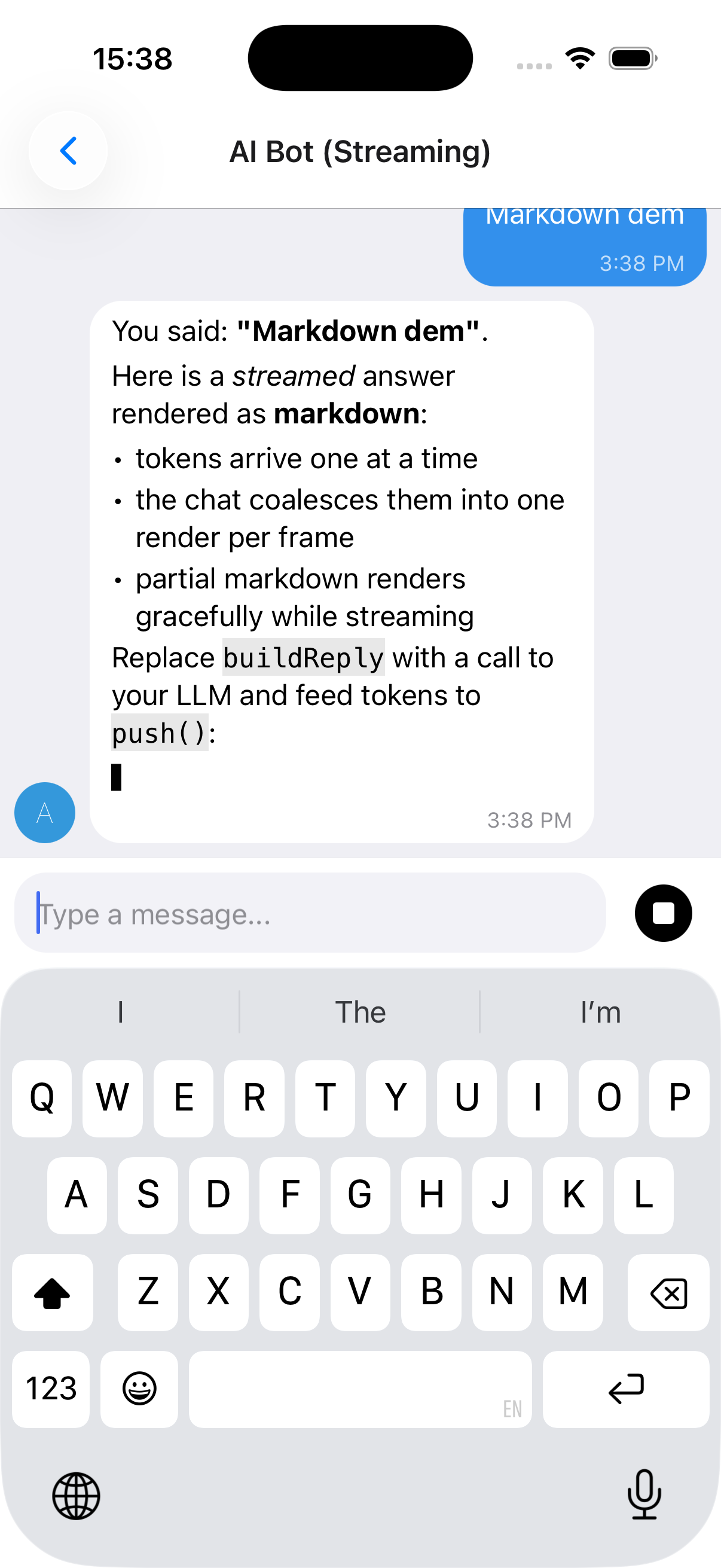
useStreamingMessages, stop control and a full example
The reply above streams in token-by-token (note the caret ▋) and renders as markdown - bold, italics, lists, inline and fenced code - while the composer's send button turns into a Stop control mid-stream. See Markdown rendering for AI replies to enable markdown.
IMessage.streaming- flag a message as streaming (shows the caret)useStreamingMessages(...)- owns the message list, rAF-batchespush(), and supports stop viaAbortController. It returns{ messages, setMessages, append, startStream, isStreaming, stop };setMessagesis there for anything the hook does not cover, so you can patch a message with a plainmap.
import { useCallback } from 'react'
import { Chat, IMessage, useStreamingMessages } from '@kesha-antonov/react-native-chat'

function Bot () {
  const { messages, append, startStream, isStreaming, stop } = useStreamingMessages<IMessage>()

  const onSend = useCallback((newMessages: IMessage[] = []) => {
    append(newMessages[0])                      // show the user's message
    const stream = startStream({ user: { _id: 2, name: 'Assistant' } }) // empty streaming bubble

    runMyModel(newMessages[0].text, {
      signal: stream.signal,                    // aborts when stop() is called
      onToken: token => stream.push(token),     // batched, one render per frame
      onDone: () => stream.done(),              // clears the streaming flag
    })
  }, [append, startStream])

  return <Chat messages={messages} onSend={onSend} user={{ _id: 1 }} />
}
See docs/STREAMING.md for the full hook API and a real Claude streaming adapter (via a backend proxy). A runnable demo lives in example/components/chat-examples/AIBotExample.tsx.
Markdown rendering for AI replies
Built-in renderer, or react-native-streamdown
AI/LLM replies are usually markdown (bold, lists, fenced code). Enable markdown with messageTextProps={{ markdown: true }} (streamed messages auto-render as markdown unless you pass markdown={false}):
// Force markdown for every message:
<Chat messageTextProps={{ markdown: true }} {...props} />

// Streamed messages auto-render as markdown; disable with markdown: false.
There are two renderers and you get the best available one automatically:
-
Built-in, zero-dependency renderer (default). Covers headings, bullet/ordered lists, blockquotes, fenced + inline code, bold/italic/strikethrough, and links. It handles streaming-incomplete markdown gracefully (a half-written
**boldor an unclosed code fence renders as plain text until complete), so it's safe to feed token-by-token. Nothing to install. Exposed asBasicMarkdownif you want to use it directly. -
react-native-streamdown(optional upgrade). When installed it's used instead, for richer streaming-safe markdown (tables, partial-table handling, etc.). It is a native module with its own peers - install the full set:npx expo install react-native-streamdown react-native-enriched-markdown remend katexIt also requires
react-native-worklets >= 0.8.3(i.e.react-native-reanimated >= 4.3), andreact-native-enriched-markdownis a native module, so a dev build / prebuild is required (it does not work in Expo Go). Pass through Streamdown's own theming/rules viamarkdownProps:<Chat messageTextProps={{ markdown: true, markdownProps: { /* ... */ } }} {...props} />
Emoji Reactions
Long-press a message to open a quick emoji picker; selected reactions render as pills below the bubble and toggle on tap. The quick picker ships in the core with no extra dependencies; a full emoji browser is optional via the renderReactionPicker override.
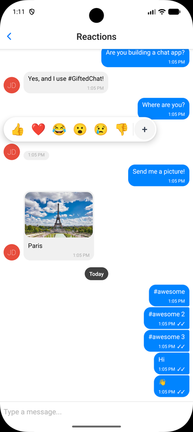
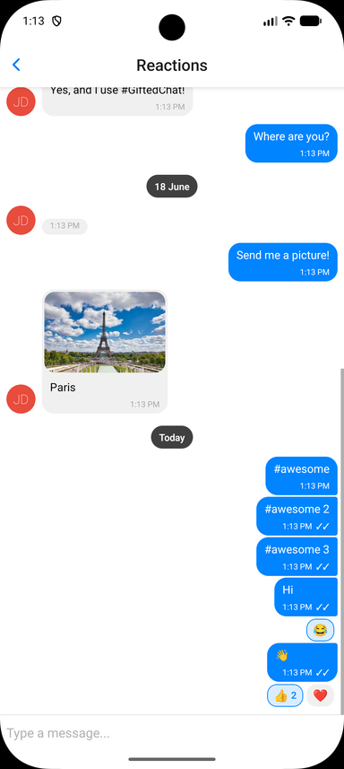
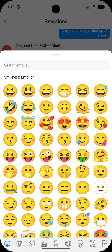
Wiring up the toggle, and the full prop list
Store reactions on each message as a reactions array, then enable the feature and handle the toggle. Reaction state is owned by you, so it works with any backend:
interface IChatMessage extends IMessage {
  reactions?: MessageReaction[] // { emoji: string, userIds: (string | number)[] }[]
}

const CURRENT_USER_ID = 1

const handleReactionPress = useCallback((message: IChatMessage, emoji: string) => {
  setMessages(prev =>
    prev.map(m => {
      if (m._id !== message._id)
        return m

      const existing = (m.reactions ?? []).find(r => r.emoji === emoji)
      if (!existing)
        return { ...m, reactions: [...(m.reactions ?? []), { emoji, userIds: [CURRENT_USER_ID] }] }

      const userIds = existing.userIds.includes(CURRENT_USER_ID)
        ? existing.userIds.filter(id => id !== CURRENT_USER_ID)
        : [...existing.userIds, CURRENT_USER_ID]

      return {
        ...m,
        reactions: userIds.length === 0
          ? (m.reactions ?? []).filter(r => r.emoji !== emoji)
          : (m.reactions ?? []).map(r => (r.emoji === emoji ? { ...r, userIds } : r)),
      }
    })
  )
}, [])

<Chat
  messages={messages}
  onSend={onSend}
  user={{ _id: CURRENT_USER_ID }}
  reactions={{
    isEnabled: true,
    onReactionPress: handleReactionPress,
    // Optional: provide a richer picker (e.g. a full emoji browser).
    // See example/components/chat-examples/ReactionsExample.tsx
    // renderReactionPicker: props => <MyEmojiPicker {...props} />,
  }}
/>
Reactions Props (Grouped)
isEnabled(Bool) - Enable emoji reactions (defaultfalse)emojis(String[]) - Emojis shown in the quick picker (default['👍', '❤️', '😂', '😮', '😢', '👎'])onReactionPress(Function) -(message, emoji) => voidcalled when an emoji is selected or a pill is tapped. Toggle logic is left to yourenderReactions(Function) - Override the reactions-display component rendered below the bubblerenderReactionPicker(Function) - Override the picker shown on long-press (use for a full emoji browser)containerStyle,reactionStyle,reactionActiveStyle,reactionTextStyle,reactionCountStyle- Styles for the reaction pillspickerContainerStyle,pickerEmojiStyle- Styles for the quick picker
Smart Link Parsing
URLs, emails, phones, hashtags and mentions
Message text is automatically scanned for URLs, emails, and phone numbers; hashtags and mentions are opt-in. Configure it via messageTextProps:
<Chat
  messageTextProps={{
    url: true,        // default true
    email: true,      // default true
    phone: true,      // default true
    hashtag: true,    // default false
    mention: true,    // default false
    hashtagUrl: 'https://example.com/hashtag',
    mentionUrl: 'https://example.com',
    linkStyle: { left: { color: '#1d9bf0' }, right: { color: '#fff' } },
    onPress: (message, url, type) => {
      // type: 'url' | 'email' | 'phone' | 'mention' | 'hashtag'
      Linking.openURL(url)
    },
  }}
/>
For full control, pass custom matchers ({ type, pattern, getLinkUrl?, getLinkText?, renderLink?, onPress? }[]) to add or override patterns. See the Links example in the example app.
Message actions (long-press context menu)
Telegram-style floating menu
Long-press a message to open a floating, themed context menu anchored to the bubble. Provide the actions via messageActions - an array, or a function of the message - each { label, icon?, onPress, destructive? }. When reactions are enabled, a reactions row is shown on top of the menu automatically.
import { setStringAsync } from 'expo-clipboard'
import { Copy, Trash2 } from 'lucide-react-native' // optional icons

<Chat
  messageActions={message => [
    { label: 'Copy', icon: ({ color, size }) => <Copy color={color} size={size} />, onPress: () => setStringAsync(message.text) },
    { label: 'Delete', destructive: true, onPress: () => deleteMessage(message) },
  ]}
/>
Note: This library no longer depends on
@expo/react-native-action-sheet. PrefermessageActionsabove. If you specifically want a native action sheet, install it yourself, wrap your tree inActionSheetProvider, and either calluseActionSheet()in your ownonLongPressMessageor pass anactionSheetprop - theactionSheetprop /context.actionSheet()escape hatch still works when you provide an implementation. The composer "+" actions use the built-in themedAttachmentSheetand need no setup.
Interactive content inside bubbles (video players, maps)
Keeping native controls tappable
When reactions or messageActions are enabled, the long-press surface spans the whole message row - the bubble and the empty space beside it, the way Telegram behaves on Android. (A tap gesture is added on top only when onPressMessage is set.) Those recognizers do not cancel touches on native subviews, so a react-native-video / expo-video player rendered through renderMessageVideo keeps its native controls interactive.
If a message must own every touch that lands on it, set isMessageGestureEnabled to false for it. The gesture surface then drops behind the bubble: the bubble's content takes its touches, and long-pressing the row next to the bubble still opens the picker - so reactions are never lost for that message.
<Chat
  reactions={{ isEnabled: true, onReactionPress }}
  renderMessageVideo={props => <Video source={{ uri: props.currentMessage.video }} controls style={styles.video} />}
  // the video owns its controls; long-press beside the bubble still reacts
  isMessageGestureEnabled={message => !message.video}
/>
Theming & Dark Mode
Token groups, runtime switching and themed components
The chat ships with a modern default look and a full token-based theme. Override any subset of tokens via theme (light) and darkTheme (dark); your overrides are deep-merged over defaultLightTheme / defaultDarkTheme, and the resolved theme switches at runtime with the color scheme (system, or forced via colorScheme). Explicit per-component style props still win over the theme.
<Chat
  theme={{
    colors: { accent: '#3390EC', outgoingBubble: '#EFFEDE' },
    radii: { bubble: 18 },
  }}
  darkTheme={{ colors: { background: '#0E1621', incomingBubble: '#182533' } }}
  // colorScheme="dark"   // optional: force a scheme instead of following the system
  {...props}
/>
Token groups: colors, radii, spacing, typography, avatar, sendButton, composer, voice. Build your own theme-aware components with the exported hooks:
import { useTheme, useThemedStyles } from '@kesha-antonov/react-native-chat'
import { StyleSheet } from 'react-native'

const MyBadge = () => {
  const theme = useTheme()
  const styles = useThemedStyles(t => StyleSheet.create({
    badge: { backgroundColor: t.colors.accent, borderRadius: t.radii.bubble },
  }))
  return <View style={styles.badge} />
}
Also exported: defaultLightTheme, defaultDarkTheme, and the ChatTheme / PartialChatTheme types.
Localization (i18n)
Built-in translations and label overrides
All built-in UI strings (composer placeholder, send/cancel, load earlier, today, voice/video/location labels, slide-to-cancel, reply/edit banner, camera-permission text) route through a label table. Built-in translations ship for es, fr, de, ru, zh, ar, pt, ja, ko, it, tr, hi, nl, pl and id, with English as the default, selected by the existing locale prop. A regional tag falls back to its base language, so pt-BR resolves to pt. Override any individual string with labels:
<Chat
  locale="fr"                       // pick a built-in translation
  labels={{ placeholder: 'Votre message...' }}  // override any string
  {...props}
/>
Exported helpers: ChatLabels (type), defaultLabels, translations, resolveLabels, and the useLabels hook for reading the resolved labels in custom components.
Message Status
Tick indicators for sent / delivered / read
Set sent, received, or pending on a message to show its delivery status. By default these render as tick indicators next to the timestamp (✓ sent, ✓✓ received, 🕓 pending):
const message: IMessage = {
  _id: 1,
  text: 'Delivered!',
  createdAt: new Date(),
  user: { _id: 1 },
  sent: true,
  received: true,
}
Customize the indicators with renderTicks (full override) or tickStyle (style only):
<Chat
  renderTicks={message => (message.received ? <MyReadIcon /> : null)}
  tickStyle={{ color: '#1d9bf0' }}
/>
TypeScript
Generic over your own message type
Chat ships complete type definitions and is generic over your message type. Extend IMessage to add custom fields and everything stays typed end to end:
import { Chat, IMessage } from '@kesha-antonov/react-native-chat'

interface MyMessage extends IMessage {
  reactions?: { emoji: string, userIds: (string | number)[] }[]
}

<Chat<MyMessage>
  messages={messages}
  onSend={msgs => {/* msgs is typed as MyMessage[] */}}
  user={{ _id: 1 }}
/>